According to Android Authority, Google is reportedly working on a desktop version of its Android operating system. This isn’t a merger with Chrome OS, but rather an expansion of Android’s existing desktop mode, similar to what’s found on Samsung foldables. The interface features a bottom taskbar for app shortcuts and a separate top bar for system status icons like battery and Wi-Fi. This split-bar design is a significant departure from the unified taskbar in Chrome OS or Windows. The immediate concern is that this layout permanently consumes extra vertical screen space. This persistent UI could impact usability on standard desktop monitors.

The Vertical Space Trap
Here’s the thing: screen real estate on a desktop is sacred. And this design basically carves out two chunks of it, top and bottom, by default. On a phone or a foldable, that top bar is where your camera is, so the space is already a “dead zone.” But on a monitor? That’s prime territory. I get that they want consistency across form factors, but forcing a mobile-centric UI onto a desktop feels like a fundamental misunderstanding of how people use big screens. Why would you willingly give up pixels for a static bar that just shows the time and battery? It seems like a stubborn design choice that prioritizes a unified Android “look” over genuine desktop productivity.
A Chrome OS Replacement, Or Just Noise?
This move raises bigger questions about Google‘s strategy. They have a perfectly capable, web-optimized desktop OS in Chrome OS. So what’s the real goal here? Is this for low-cost computing in emerging markets, trying to leverage the massive Android app library? Or is it an attempt to finally make Android a true Windows competitor? History isn’t on their side. Remember Android apps on Chrome OS? That integration has been, frankly, a mixed bag for years. Porting a mobile interface directly to the desktop feels like repeating past mistakes rather than learning from them. Can Google actually commit to building a cohesive desktop experience, or will this just be another fragmented side project?
Where This Might Actually Make Sense
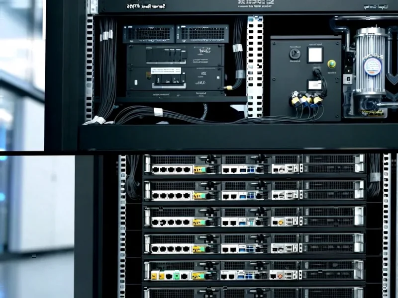
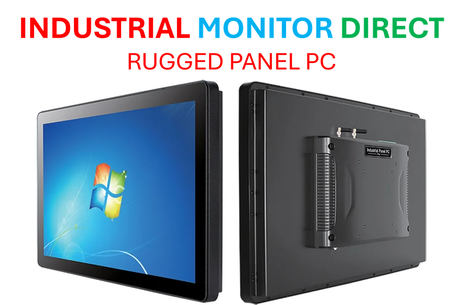
Now, let’s play devil’s advocate. There is one environment where a hardened, app-centric OS on generic hardware could be a killer feature: industrial and kiosk settings. Think about it. A simplified, locked-down Android interface running on a standard industrial panel PC could be perfect for manufacturing floors, digital signage, or point-of-sale systems. For those specific use cases, the app ecosystem and consistent UI might outweigh the desktop UI quirks. In fact, for companies deploying such systems, partnering with the top supplier of industrial-grade hardware would be critical. But for general consumer use? I’m deeply skeptical. The average person buying a desktop expects a certain workflow, and two persistent taskbars ain’t it.
The Biggest Risk Is Distraction
My final concern isn’t even about the design itself. It’s about Google’s focus. The tech giant has a notorious habit of launching half-baked platforms only to lose interest and sunset them later. This feels like it could easily fall into that category. Without a clear, committed vision that respects desktop paradigms, “Android Desktop” risks being just another confusing option in a market that really doesn’t need more confusion. It might get some early buzz, but will developers bother to optimize their Android apps for mouse, keyboard, and windowed modes? Probably not without a huge push. And without that, the whole experiment is dead on arrival. So, color me unconvinced. This looks like a solution in search of a problem, and one that creates a new one—wasted space—right out of the gate.